a window, a book, a machine. No step was as significant to the development of The Réal as nailing down what would be its interface. When you consider the confused and convoluted exchanges which dominated the first 9 months of The Réal's production, settling on a fixed organizing principle (in this case, the graphical user interface) marked a definite turning point. The idea to organize the project in terms of tabloid stories, stored in an elecronic scrapbook that worked like a slot machine came to José in a dream. Ralph created the subsequent and final GUI design.
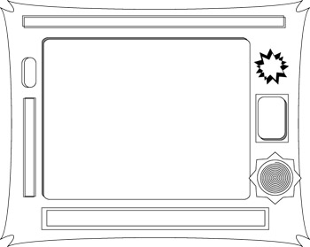
This black and white drawing is most likely a second or third draft done in Adobe Illustrator. The original sketch was done on a napkin, in a parking lot, near Potrero Hill, San Francisco. The challenge was to somehow come up with a static interface that would nonetheless keep the reader entertained. Much has been written about interactivity and the changing role of the reader-cum-user. Our strategy presumes that reading, really reading something, is still the most interactive experience. We only regret that the user cannot write on the margins or tear pages out. Then again, there are moments throughout the CD-ROM where opportunities for "gaming" take place. These miniature video games break apart the experience of reading a book with a moment that is altogether cheap and silly. We hope. |
 The importance of capturing Vegas in the interface is quite dramatically rendered in this illustration. Thankfully, the Jetson's never got hold of this deco design. Despite all the fluorishes, the basic components of the final interface design are already here--and then some. There were to be multiple windows for various types of information (coins, rolls of paper, pencils, a movement joystick, etc.) and the importance of the central screen had clearly not yet been developed in this sketch. As The Réal became more of a readerly rather than visual project, this central screen grew out to encompass the greater part of the screen.
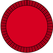
In the end, the kind of Vegas we "painted into" the design is based on a nostalgia for the one-armed bandit. This, "instant classic" slot machine [seen below] is rooted in the opening words of The Réal, in which sand swallows Vegas whole.
The importance of capturing Vegas in the interface is quite dramatically rendered in this illustration. Thankfully, the Jetson's never got hold of this deco design. Despite all the fluorishes, the basic components of the final interface design are already here--and then some. There were to be multiple windows for various types of information (coins, rolls of paper, pencils, a movement joystick, etc.) and the importance of the central screen had clearly not yet been developed in this sketch. As The Réal became more of a readerly rather than visual project, this central screen grew out to encompass the greater part of the screen.
In the end, the kind of Vegas we "painted into" the design is based on a nostalgia for the one-armed bandit. This, "instant classic" slot machine [seen below] is rooted in the opening words of The Réal, in which sand swallows Vegas whole.
|
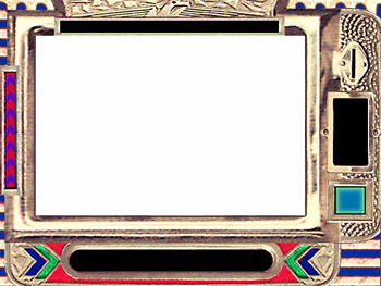
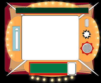
Sand or silicon, the coppery, faux-historical look of The Réal's interface is a reassuring anchor of physicality in a sea of information. (Art critics stand back.) In all seriousness, though, the combination of patriotic and desert themes, deep and dark blues, reds and greens (from the color of most betting chips) and the presence of a grainy, metallic texture are awesome achievements. Ralph, who put together the interface, is an illustrator who works for such traditional print venues as Harper's and the Wall Street Journal. That conservative flair shows up quite nicely in the context of Mamey-styled robot maids, ice skating showgirls and an alien security guard pin up doll. For the detail-oriented: notice how thin the coin slot is on the top right hand corner. When the animated coins were brought in [see below], they obviously didn't fit. Luckily, this slot machine/scrapbook only exists in digital space and the proper repairs were made in a matter of seconds. |
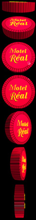
| CHIPS, computer and not The coins that you see to the right -- the chips used to propel The Réal -- were drawn in Adobe Illustator and rendered in Specular's Infini-D. The software used was at least three years old and, ahem, ran very slowly. Luckily, we were never able to realize the fantasy of a virtual Vegas. After all, the real Vegas is damn virtual enough. Join us in a moment of silence as we consider the sorry state of graphic design in this era of "digital art." People should go outside more often. Here's the rasterized Illustrator file used for the chips: |
 | But perhaps the most important technical innovation used in making The Réal is this little piece of "distressed" Scotch® tape. Look for it on almost every single page of The Réal, cut up and stretched to accomodate various settings but, nonetheless, the exact same piece of tape.
Instead, you should know that almost all pages in The Réal were laid out in Adobe Illustrator and then worked-over in Adobe Photoshop. Additionally, the dimensions of the The Réal's main window are: 460 x 315
Also worth noting, the hand you see shuffling screens during the opening sequence--
|